Awarded design
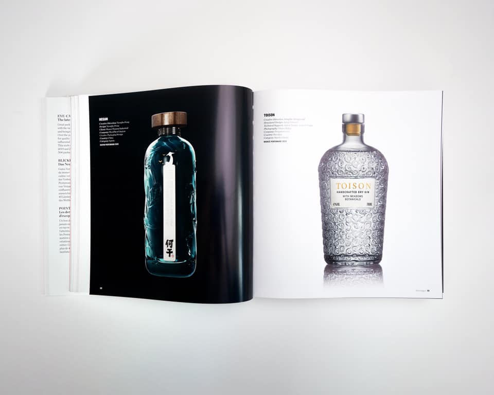
The gin's name cleverly conceals a reference to its Slovak origin, as symbolised by sheep's fleece (from the French TOISON), which is further stylishly exemplified by the bell-shaped bottle
We told the designers of the bottle the legend about the origin of the city of Trenčianske Teplice, during the meeting. According to an old story, the healing springs were discovered by a lame shepherd who was looking for a lost sheep. This is how the design for the exceptionally strong TOISON gin was born.
The bottle and label from the hands of the design studio won bronze at the world packaging design competition Pentawards 2020, and TOISON became part of the global packaging design publication Design Book. The unique taste of gin has been recast into another international IWSC award. The design of the bottle also scored in the prestigious world Red Dot Design Award.